Album Cover Art
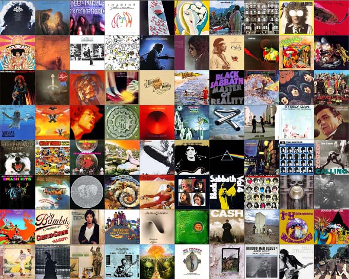
- My record buying years spanned the Golden Age of Album Cover Art.
- This is a collection of some of the LPs that meant something to me. Just another self portrait of sorts.
- I remember long afternoons browsing through albums at the local head shop and record store “One Sweet Dream“, complete with black lights and incense.
- Later, I spent many lunches with Mr. Johnson down at Rose Records on State Street, flipping through cases of classic vinyl.
- I’d come home with bags full of good stuff. Bought with no recommendation other than the cover art.
- I remember listening to new purchases while holding the cover in both hands, studying the details.
- For big favorites, the turntable would be set to auto-repeat, the album cover would be propped up, facing outwards, always.
- Interesting. I had a program randomly arrange the images. There is only one solo album by John Lennon and only one by Paul McCartney. And yet they ended up side by side, Lennon and McCartney. How cool is that?
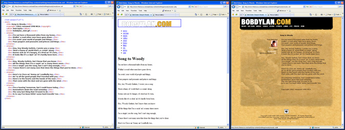
(XML + XSL = HTML) + CSS = this
I really like the way this works. This is a good example that highlights the flow. You start with a raw XML file. Performing an XSLT translation on that creates basic HTML content. Apply a CSS style sheet to that, and you get a beautiful web page.
The part I like best is that you can specify the translation file directly in the XML and have the browser do all the work. There is something very elegant and slick about that. It may not be appropriate for web crawling spiders, but you could always have the server perform the translation in those cases. In fact, serving up pages specifically optimized for spiders is a common practice.
I don’t know why I’m so into this. I just know it happens sometimes, and if I give into it and play around with it, eventually I’ll be satisfied, then I can move on to something else. I did want to create this nothing so I would have a good example of the practice in case I ever wanted to use it in the future.
Bully Bully
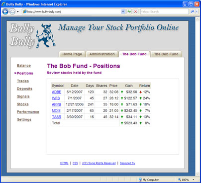
I know I haven’t posted in awhile. But it’s because I’m obsessed with a new project. I get ideas for new projects all the time. I normally entertain these ideas, and then let them go. I’m very picky about which ones I decide to make physical. Because once I take one on, I’m consumed with it until it’s done.
This new project is called ‘Bully Bully’. It’s a remake of my old stock market program ‘The Bob Fund’. Because it’s a big project, I needed to have a lot of good reasons to actually do it.
-  I opened Roth IRA accounts at Scottrade for Deb and myself. ‘The Bob Fund’ was built for a single account. I needed a new system that will manage multiple portfolios.
- ‘The Bob Fund’ runs on my Windows desktop machine at home. I wanted to design a new system that can run on an open source hosting service, freeing up my personal machine.
- I’ve been working in ASP.NET for awhile, and I don’t like it. I wanted to get back into PHP, and this is a good excuse to do that.
- I’ve learned a lot about XML and XML Stylesheets. It will be fun to design a new system from scratch, taking full advantage of these technologies by building them right into the core of it.
- I’ve just finished a book on web design called Don’t Make Me Think and I’m very eager to try out all the new stuff I’ve learned.
Code Monkey
This is a boring post about programming. If you’re not into technical trivialities, you may want to skip this one.
Lately I’ve been playing around with a lot of different programming languages. If you combine them all together, using each one the way it was designed, you can get some amazing results.
Â
I have a webpage that reads data, sorts it, and displays it in a table. Clicking on the column headings changes the sorted display. Normally a webserver would have to fetch, and sort, and transmit that information over the internet every time you click the page.
I’ve found a way, with a small amount of JavaScript and XSLT code, to make browsers do all that work. Browsers download the data one time only, sort it there, render it on the page, handle all the re-sorting and re-rendering. This greatly improves response time, and takes a load off the webservers and database servers.
Click here to see this bad boy (source code included) in action.
Space
This is an experimental piece. I am interested in finding new ways to communicate ideas and information over the Internet. The interactive nature of the web is providing fresh opportunities.
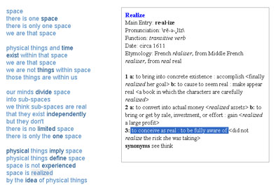
So I created this webpage containing a poem I wrote about space. About the Void. It was inspired by a quotation by Andy Warhol. The webpage looks simple and uncomplicated, but it contains many subtle details designed to communicate these ideas more clearly.
First, there were the traditional choices about line spacing, punctuation, spelling, and capitalizations. But on a webpage, I also have complete control over fonts, font sizes and colors. And then there were the hyperlinks – words that when clicked, bring more information into view. These were designed to be unobtrusive, to provide emphasis, not to interfere with the flow of the poem, yet visible enough to be functional.
When these keywords are clicked, their definitions appear on the page in traditional Merriam-Webster dictionary style. I love these online dictionaries, where definitions of words contain other words that can be clicked, and defined, in a sort of endless loop. Dictionary formats are very sophisticated in their use of font faces, font sizes, font bolds, underlines and italics, punctuation, lists, parentheses, braces and brackets. And every subtle choice is designed to convey meaning.
I modified all this to help me express my thoughts more precisely. I carefully chose which words to provide definitions for. In these definitions I included entries that matched what I was going for, and excluded entries that were off the mark. I used foreground and background colors to highlight phrases that most closely matched my intentions. I attempted to convey exactly what I meant with each word within the context of the poem, rather than defining the meaning of the word in a more general, larger context.
I personally got a lot out of this exercise. I discovered that many of the secondary dictionary definitions gave me a deeper understanding of the concepts these words were attempting to represent. Including a word’s etymology was often enlightening. Knowing that the word ‘time’ was derived from an earlier word meaning ‘tide’ is very interesting. The choices made for synonyms or ‘see also’ were intriguing. For example, linking the word ‘fear’ to the word ‘experience’ has some interesting implications.
Moticos
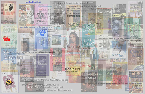
Moticos – a fully realized nothing containing accidental meaning.
I felt compelled to make this piece after being exposed to several new ideas in quick succession.
While exploring the blogging phenomenon, which was all new to me, I discovered the power of cascading style sheets (CSS). I was especially interesting in using style sheets to control the background images of elements, rather than using the traditional method of inserting images directly as content.
On my new job I was exposed to XML and XML style sheet transformations (XSLT) as a technique to convert basic data elements into content for the web. I immediately saw that combining XSLT with CSS would be an elegant way to convert raw data into something beautiful on the screen.
At the same time I was playing around with Zaadz, a social networking website. Zaadz had pages where members listed books they owned. These lists were communicated by displaying book cover images. These web pages of colorful images, of identical dimensions, were beautiful. And meaningful. Seeing books by the Dalai Lama next to books by Thoreau had implications about the owner. I thought the next logical step was to do the same thing for movies that the member enjoyed.
Everything came together when I saw How to Draw a Bunny, a documentary about collage artist Ray Johnson. I would make a collage of books covers, movie posters, and quotes I thought were interesting. Instead of canvas and paint, I would use programming and digital images, a medium I am more comfortable with. The name “Moticos” is a tribute to Ray.
Then I took it one step further by making it interactive. As you move the mouse over the collage, related image components rise to the top. This allows you to see how it was constructed, which I thought was interesting. Since I was exposing the construction technique, I thought I might as well add a layer for the actual code itself. Well designed code is a beautiful thing to me. Even if you step back where you can’t read the actual lines, I still see a certain elegance in it.
Finally, I realized this collection of things I liked, was actually a self portrait of sorts. So, I added a self portrait image layer from a photograph I had taken of myself a few years earlier.
